

O2 Priority
Transforming the onboarding experience for higher engagement and smarter personalisation.
Role: Product Designer UX/UI
Project type: User onboarding optimisation, product design & strategy (IOS & Android)
Sector: Loyalty/Rewards
Clients/Customers: B2C
To improve long-term engagement and app adoption, I led the redesign of the onboarding experience for O2 Priority, a critical first impression for millions of users.
Our goal was to turn a functional but forgettable flow into something more powerful: an experience that felt personal, intuitive and valuable from the very first tap.
By simplifying interactions, aligning with a refreshed brand identity, and building in meaningful personalisation, we crafted an onboarding journey that increased clarity, built trust, and helped users instantly connect with what Priority could offer them.
My roleUX + UI design, stakeholder management, and implementation
As Product Designer, my role spanned discovery, UX strategy and delivery:
UX design & flows - I partnered closely with our UX researcher on journey mapping, flow exploration and insight synthesis.
Stakeholder management – I spent dedicated 1:1 time building trust with the newly appointed product owner, working from the O2 office weekly to embed into the team and foster collaboration.
User testing & iteration – I ran multiple rounds of user testing across design iterations to validate usability, tone and interaction clarity.
UI design & delivery – I applied the O2 Priority design system throughout, introducing new design tokens where needed to expand the component library and maintain visual consistency.
VisionMake onboarding feel more like a welcome, and less like a hurdle
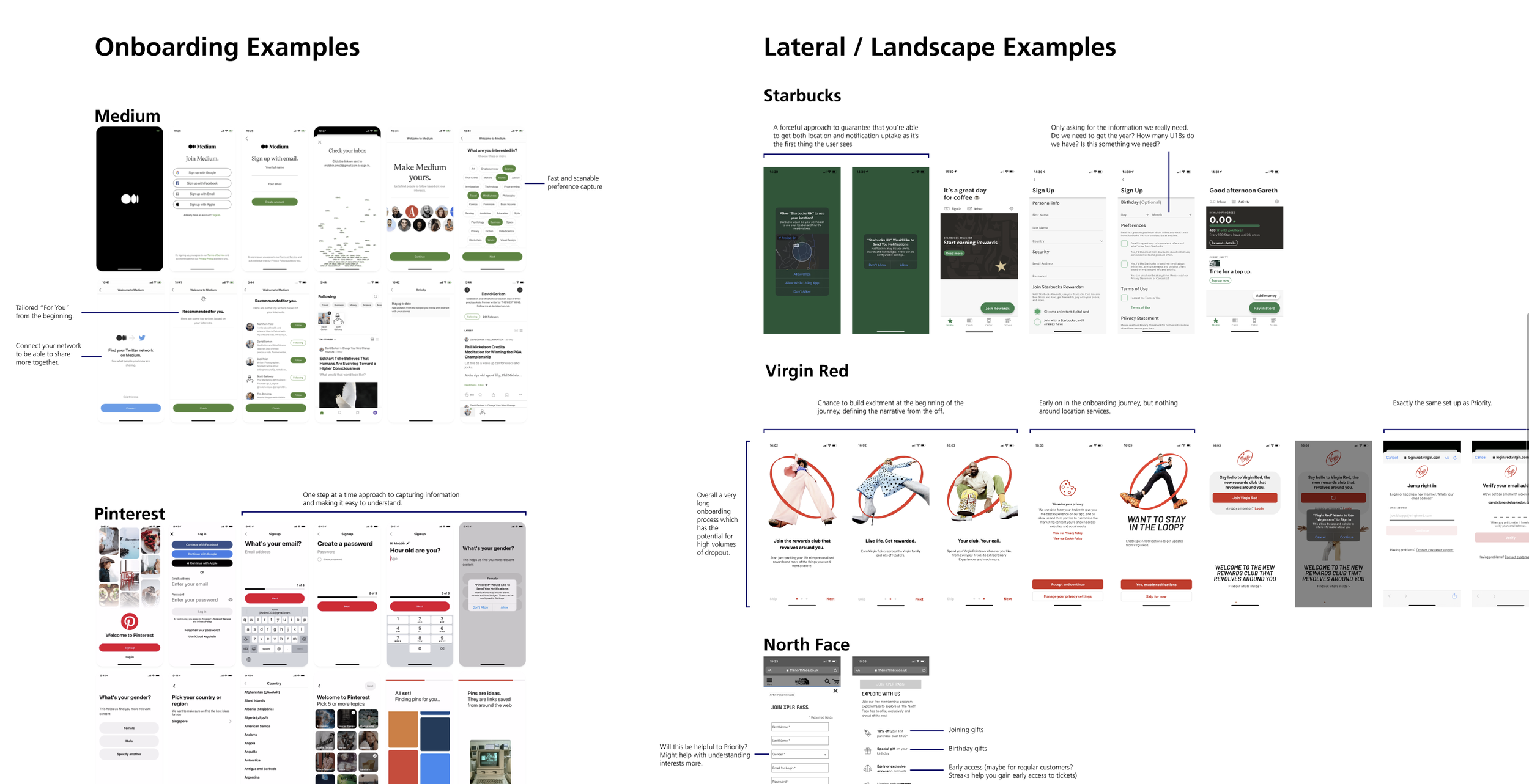
The original flow (see image), missed two key opportunities:
It didn’t reflect the updated O2 Priority brand.
It didn’t personalise or explain the value of sharing preferences.
Our ambition was to transform onboarding into a more user-centred, emotionally resonant experience that would:
Educate and inspire new users.
Encourage preference sharing by building trust and showing clear value.
Create a foundation for personalised content and improved engagement over time.

ApproachBuilding trust, aligning teams, and iterating fast
I joined during a period of transition, with a new product owner coming on board. Gaining her confidence quickly was key, so I focused on transparency, collaboration and inclusive design decision-making.
In partnership with a UX researcher, we:
Audited the existing onboarding flow to identify pain points.
Benchmarked best-in-class onboarding from apps like Spotify, Pinterest and Bumble.
Aligned messaging across in-app onboarding and Priority’s broader comms with the marketing team.
Prototyped and tested interactive flows with a mix of new and existing users, including older and less tech-savvy demographics.

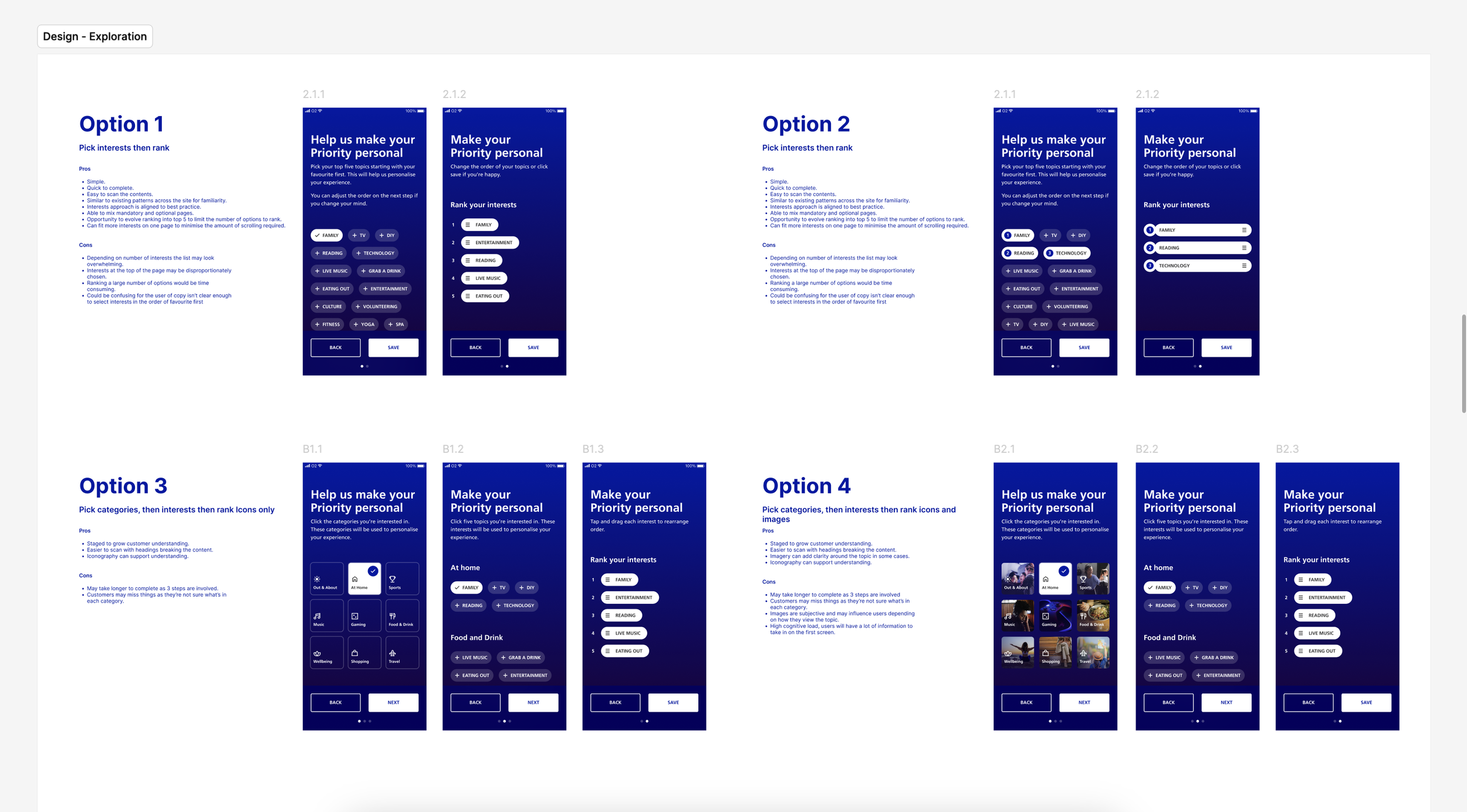
StrategyDesigning for clarity, curiosity and confidence
We used a clear set of design principles to guide the new experience:
Clarify the value: Be transparent about why we ask for preferences and how it benefits the user.
Make it personal: Use smart defaults, tone of voice and light customisation to help users feel seen.
Engage with interaction: Add subtle animations and micro-interactions to create delight.
Prioritise accessibility: Ensure the experience is inclusive, legible, and WCAG compliant.
The user base spans a wide age range, from deal-hungry Gen-Z users to older, more traditional customers, so we needed a flow that struck the right balance between energy and clarity. Usability testing across diverse user groups helped us get this right.
OutcomeAn onboarding experience that earns attention and delivers results
We introduced a new, streamlined onboarding flow with a compulsory preference-setting step that clearly communicated:
What users could expect from the app.
Why sharing preferences improves their experience.
How to complete setup in just a few guided taps.